


To fill this gap, Google teams collaborated with marketing agency Incubeta and UX optimization agency Call To Action Digital (CTAD) to conduct in-depth UX/UI audits and A/B tests on websites and applications across various industries. These analyses provide a data-driven map of design strategies that consistently increase conversion rates.
Here are the 3 fundamental design secrets that will drive consumers to click “Buy” or “Sign Up” on your website:
1. Start Strong, Finish Strong: Master Entry and Exit Points
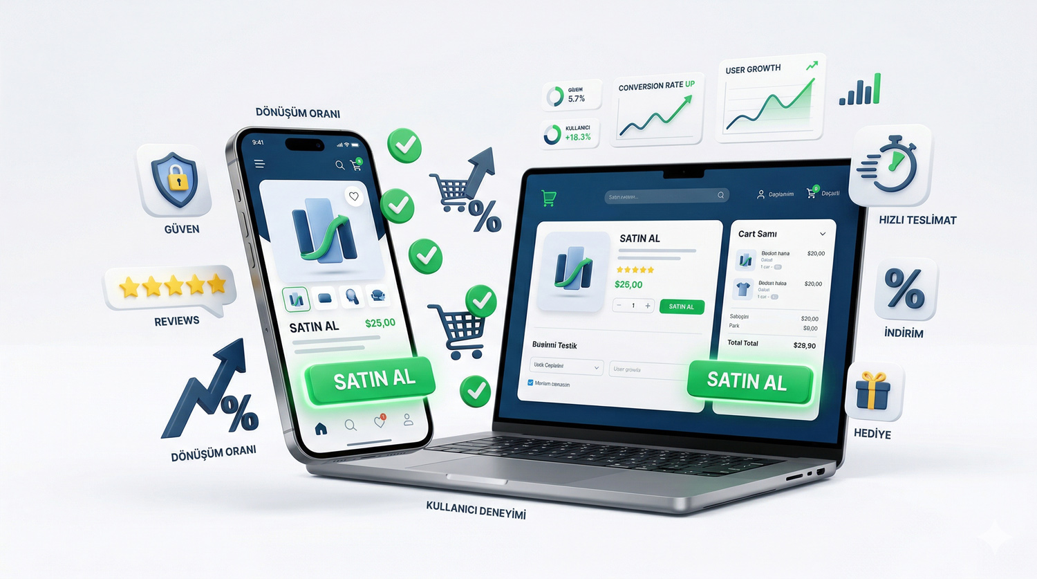
Most users abandon a website either at the very beginning or end of the customer journey. Data shows that 60% of users abandon their purchase (cart abandonment) due to checkout issues. That’s why it’s critical to focus a large portion of your optimization efforts on landing pages and especially the final checkout experience.
Improve Your Landing Page
Your landing pages must align with your marketing messages and focus on value propositions that directly solve consumer problems.
Narrow Targeting: Design pages that appeal to a narrow and well-defined group rather than broad audiences.
Speed: Your page load speed should ideally be around 3 seconds.
Personalization: If you’re running multiple campaigns for different audiences, create separate landing pages with customized messaging and visuals for each.
Visibility: Place your clear and action-oriented call-to-action button (CTA) “above the fold” — visible without scrolling when the page first opens.
Build a Flawless Checkout Page
The checkout page is the most important stage where people reach the end of their shopping journey. A personalized message reminding them what they’re buying and its benefits can boost conversions.
Trust Building: Don’t hide payment options behind extra clicks; make them visible with universally recognized icons.
Fast Payment: Set device- or region-specific local payment methods as default so people can pay quickly.
Autofill: According to Shopify data, guest checkouts that auto-fill saved information have 45% higher conversion rates (CCR) than those without autofill.
2. Choose the Most Ethical Path to Conversion
Fake countdown timers, misleading “old price/new price” labels, or unfounded out-of-stock warnings… These manipulative tactics known as “dark patterns” are losing their effectiveness as consumer awareness grows. Relying on them damages your brand credibility. Instead, you can use behavioral science principles to achieve similar results without compromising ethics:
Social Proof: Good customer reviews persuade purchases because we tend to trust others’ opinions. Research shows this is the strongest principle that resists discount expectations.
Endowment Effect: Give people a sense of ownership through free trials, samples, or personalization. This cognitive bias makes us value things we feel are ours more.
Customer as the Hero: Instead of focusing only on product features, make your customer the hero of the story. Position your brand as a trusted helper guiding the customer to a positive outcome.
3. UX Essentials: Clarity, Consistency, and Error Prevention
There are core usability principles to keep in mind when designing a website. The lack of these principles causes cognitive friction (mental effort and frustration), leading users to abandon the site:
Clarity: Users should always understand what’s happening on your website and what to do next. Clear language, intuitive labels, and instant notifications like “added to cart” prevent confusion.
Consistency: Menus, buttons, and navigation elements should remain in the same place across pages. This makes the site experience predictable, creating trust and familiarity.
Error Prevention: Anticipate potential errors before the user takes action. For example, confirmation prompts like “Are you sure you want to delete this?” or graying out (making unclickable) inactive buttons fall under this scope.
Boosting conversions isn’t about guessing or manipulative tactics. By choosing ethical storytelling principles and implementing the trio of clarity, consistency, and error prevention, you can win loyal customers.